
How we present ourselves is just as important as what we do. That’s why we redeveloped our brand identity to reinforce our core values, strengthen our teams, and build a more cohesive experience.
Here are some of the highlights:
How we present ourselves is just as important as what we do. That’s why we redeveloped our brand identity to reinforce our core values, strengthen our teams, and build a more cohesive experience.
Here are some of the highlights:
We changed to Purdue Space Program to create a stronger identity that better represents the other teams that were formed over the history of the organization.
To make sure that all teams can be better represented as a part of SEDS and externally in competitions, we needed to refresh our identity. Our new design system allows teams to be represented equally as a part of the organization.
Our past design system was undefined and inconsistent, which hindered recognition from other teams and organizations. Having strong consistency and readability in a visual identity will help with increasing publicity and recognition in competitions, companies, current and prospective members, and other teams.
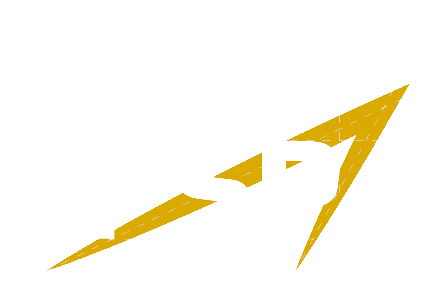
The PSP Logo is the biggest element of our identity. It encapsulates the mission and vision of PSP and is designed to be easily identifiable in all sizes and mediums.
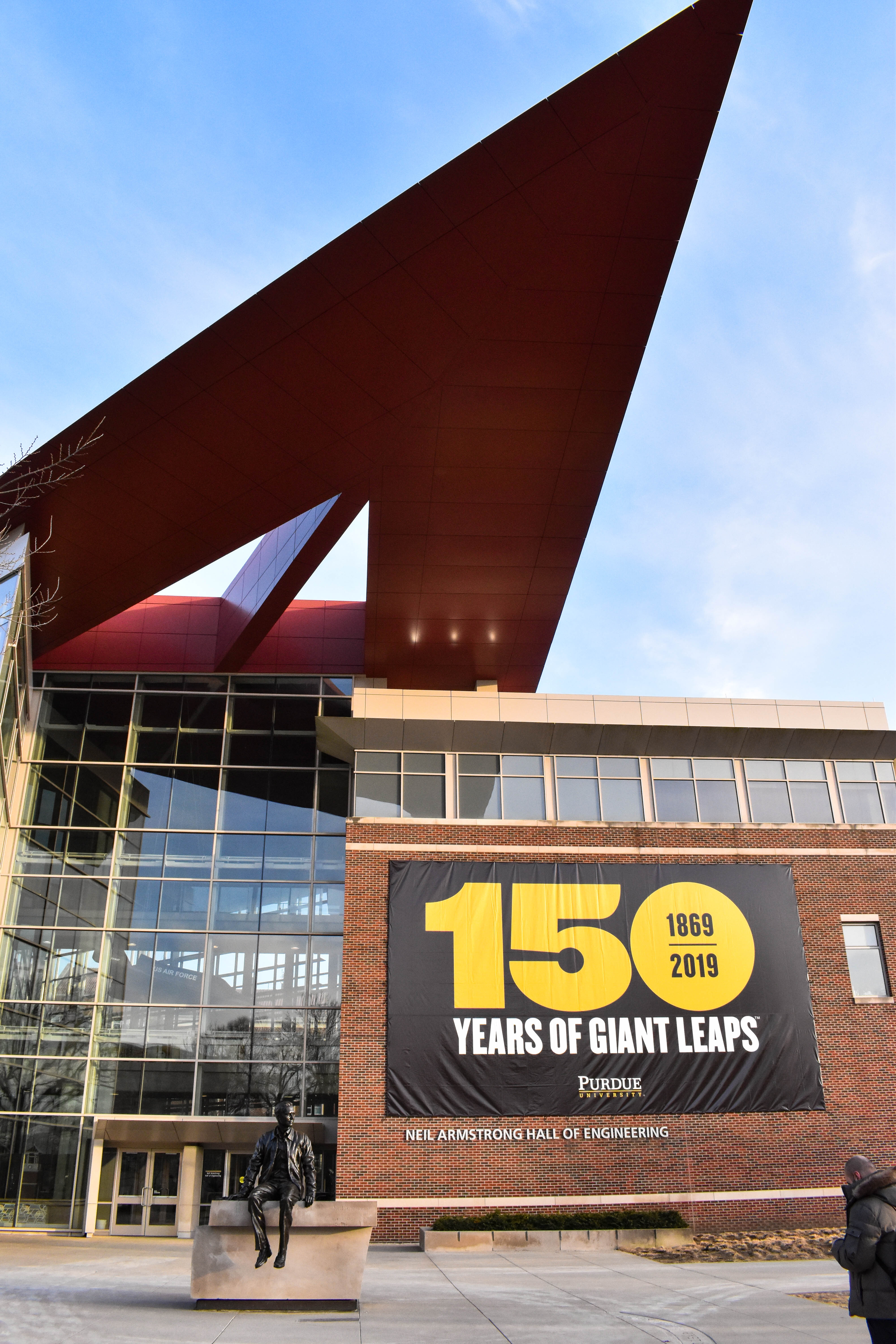
Inspired by the unique architecture of Neil Armstrong Hall of Engineering, the PSP Logo represents our core values of innovation and empowerment.
Dubbed “the vectors,” the graphical element of the PSP Logo points up and to the right, signifying forward-thinking and our desire to reach higher.
As a recognized club at Purdue University, it’s important that we inherit the Old Gold and Black. We’ve adopted Purdue’s Rush gold and introduced a slightly lighter variant of black called Night Sky.
We selected Libre Franklin as the primary typeface for headings and body text for its modern design, readability, and accessibility as a free-to-use font.
The PSP Logo uses Saira Bold and Saira Condensed for its technical and futuristic look, and is also available online as a free-to-use font.
Libre Franklin Thin
Libre Franklin Light
Libre Franklin Regular
Libre Franklin Semibold
Libre Franklin Bold
Libre Franklin Black
Called Mission Control, these guidelines dive in to using the right logos, fonts, colors, and all other aspects that make the PSP brand come together.
Bring the PSP brand to life. Get all of PSP’s logos, fonts, and templates necessary to make your content a part of our visual identity.
Contact the branding chair for access.
